


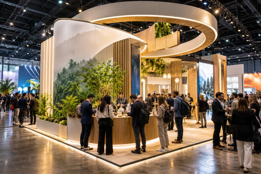
Last year, halfway through a very long day at a very crowded show, something became obvious. The stands with people four deep around them had almost nothing in common on the surface. Different industries, different budgets, different sizes. But underneath, the same bones. The same handful of design decisions kept turning up on the busy stands and being absent on the empty ones.
That’s worth knowing before spending money on 2026 shows, because most exhibitors haven’t caught on yet. There’s a window here. Seven things below, roughly in order of how often they showed up.
7 Design Trends To Experiment With In Your Next Trade Show Exhibits
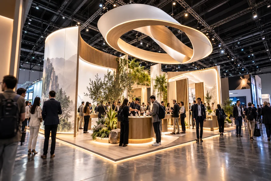
1. Rental Structures With Custom Faces
Quietly the biggest practical shift for 2026 budgets. The assumption that a brand must own its entire stand is falling apart.
The structure is rented. An appropriate professional framework, reorganized for the show. Over the top goes the custom layer, printed graphics, fabric, and the fixtures that carry the brand. Everything that is visible is custom; nothing owned has been stored in a warehouse for eleven months, and every event has a structure that fits its space. Thus, trade show rental booths have entered mainstream conversations rather than being the budget option people quietly discussed. Full custom look. No storage bill. New layout when it is desired.
2. Backlit Fabric Instead of Rigid Panels
Those glowing curved walls that keep turning up everywhere lately. Tension fabric stretched over a frame, LEDs behind it.
The look works for boring practical reasons as much as aesthetic ones. Fabric lit from behind shows color way better than a flat panel under standard hall lighting, which is famously terrible. The frames can bend into curves and arches. Weight drops massively compared to rigid builds, and so does shipping cost. And the whole thing packs into a smaller bag.
A few years back this was an expensive option. Now it’s just the normal option for anyone serious, which means not having it starts to stand out, and not in a good way.
3. Hands-On Over Screen-On-A-Stand
The video wall playing a loop to nobody is dying out. Slowly, but it’s happening.
What replaced it is stuff to do. A demo someone can pick up and use themselves. A short walkthrough with something to take away. Even the floor plan gets involved, pulling people through the stand in an order, and sticking a couple of chairs somewhere quieter so an actual conversation can happen away from the din.
The question decent designers ask now, at the sketch stage, sounds strange but works. What will the visitor have done before they walk off? Touched something, tried something, sat down. Anything beats watching something.
4. Booths Built to Be Photographed
Started by accident, now completely on purpose.
One exhibitor builds a corner that looks good; visitors photograph it, and post it, and the stand gets seen by thousands of people who never came near the venue. Other exhibitors watched this happen and redrew their plans. So now there are stands with spots designed for standing in, lighting that works for phone cameras rather than just eyeballs, and branding placed to survive being cropped.
It’s a weird way to design a physical space, asking how it’ll look inside a stranger’s Instagram story. But that’s where a chunk of the audience is now. Nobody’s at the show, and everyone’s scrolling.
5. Modularity Built In From the Start
Underneath all the design talk there’s a spreadsheet, and this is what’s on it.
Stands are being built from parts now. Walls that come apart and go back together differently. Counters with more than one working position. Graphics made to be swapped out instead of binned. So the 20×20 from the spring show becomes a 10×10 in autumn, same kit, new layout, no rebuild. Over a season of shows, the saving is real, and it also means changing strategy doesn’t mean starting over.
Ask this question early when ordering trade show exhibits. How does this stand reconfigure for a smaller space? A designer with a fast answer has done it before. A pause means a one-off builder; walk away.
6. One Hero Feature, Not Ten Nice Ones
The busy stands had a focal point you could spot from across the hall. The empty ones had lots of things going on, all of them reasonably nice, none of them dominant.
That’s the difference, more or less. A giant screen curved around the stand. A product replica at absurd scale hanging overhead. One big visual moment, then quiet everywhere else. Nearly everyone makes the mistake of adding the hero feature and keeping all the usual panels and pull-up banners too. Then it’s just noise with a center.
Think about how anyone describes a show afterward. Not in detail. “There was this stand with a massive glowing thing.” One image survives. Make sure it’s yours.
7. Sustainability as a Visible Choice, Not a Claim
Show visitors have started looking at materials. Not reading the sustainability page on the website, actually looking at the stand and thinking about what it’s made from.
The stands that benefit put it in plain sight. Timber that’s obviously reclaimed. Fabric that’s recycled, with that fact stated right there on the wall. Actual living plants in the structure instead of plastic ones. Frames openly built to be used ten times rather than skipped once. And here’s the slightly funny part: the eco stands are usually better looking too, because real materials have character, and laminate doesn’t. Reputation points and cost savings from one decision. Doesn’t happen often.
End Point
Add it up, and the pattern is almost annoying in how unglamorous it is. One strong visual. Fabric with lights behind it. Somewhere worth a photo. Something to do with your hands. Parts that reconfigure. Materials worth showing off. A rented frame under custom graphics. None of it requires the biggest budget in the hall; all of it requires deciding early. Get two or three of these into the design at the start, and the stand has a genuine shot at being the one people mention on the drive home. Against three hundred others, that’s the whole game.
