


By the Phenomenon Studio product team
Why the biggest risk in an agriculture software project usually starts in discovery, not the interface, and what research built for real field conditions looks like.
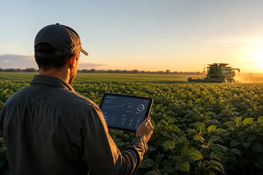
This is still one of the most common failure patterns in farm software rollouts. A dashboard prototype tests perfectly in a conference room, then fails the first time someone tries to tap it wearing work gloves in direct sunlight. Nothing about the interface is broken by any conventional standard. It just was never tested against the conditions it has to survive.
That gap between a conference-room demo and a field reality is where most agriculture product design work goes wrong, and it traces back further than the interface itself. It starts in discovery, the research phase that’s supposed to tell a design team what conditions a product has to work under before a single screen gets drawn.
Why office-based discovery research doesn’t transfer to a field product
A standard discovery process for a SaaS product assumes a fairly stable environment: a participant sitting at a desk, a reliable connection, one screen at a time, enough quiet to think through a question carefully. Farm operations research rarely gets any of that. The person who’d give the most useful feedback is often outside, moving between tasks, checking a phone screen for seconds at a time between other jobs that can’t wait.
Discovery UX built for a typical office SaaS product assumes a stable environment that a field operation rarely has. Running the same interview format anyway, just because it’s the template a team already knows, produces answers shaped by the office setting rather than the job the product needs to support.
Good design work depends on discovery finding the real conditions first, not guessing at them from a conference room. A researcher who never leaves the office is left designing around a mental model of farm work rather than the thing itself.
What changes when discovery happens during an actual field season
Timing matters more here than in most other verticals. A farm operator describing their process from memory in the off-season tends to skip steps that have become automatic, the small workarounds and manual checks that only surface when someone is watching the work happen in real time.
Timing research around the season, rather than around a sales team’s calendar, is what catches these gaps before launch. A planting-week observation session surfaces friction a January phone interview never will, because the friction only exists under planting-week conditions.
According to McKinsey’s global farmer research, farm-management software is the most widely adopted precision agriculture technology among surveyed farmers, ahead of precision agriculture hardware and remote-sensing tools. (McKinsey, 2024)
That adoption pattern is worth noting for exactly this reason. Software is often the first digital tool a farm operation trusts, which raises the cost of getting the interface wrong on the first attempt.
Designing research around unreliable connectivity, not around it as an afterthought
The USDA’s most recent farm computer usage survey found a meaningful share of U.S. farms still operate without reliable internet access, a constraint discovery research has to account for directly rather than assume away. Testing a prototype only on office wifi tells a team nothing about whether the product still works when a sync fails halfway through a field session.
Good discovery UX research treats spotty connectivity as a design constraint to test against, not a problem to patch after launch. That means testing prototypes with connectivity deliberately throttled or cut, and watching what a user does when a screen doesn’t load the way it’s supposed to.
Interviewing across a wide range of digital comfort, without designing down to the lowest common denominator
Farm operations often run with a wide range of digital comfort under one roof: a younger staff member who’s fluent in five different apps, and a longtime operator who trusts a paper log more than any screen. Interviewing only the most tech-comfortable person on an operation and designing as if that person represents everyone is one of the fastest ways to ship a product half the intended users end up avoiding.
The fix is finding out, specifically, which tasks need to be simple enough for anyone and which can assume more comfort, then building the interface around that split instead of a guess. Designing every screen for the least confident user by default tends to frustrate the people who’d otherwise get the most value from a faster, denser interface.
A short example of how this plays out
An agriculture technology company we partnered with had already built a full mobile app based on discovery interviews conducted entirely over video calls with operations managers in their offices. Once the app reached actual field staff, adoption stalled almost immediately. The navigation assumed a manager’s task order, not a field hand’s, and the offline mode failed silently instead of showing a clear sync status.
A single week-long field visit after launch surfaced more actionable findings than the entire original discovery phase. The team rebuilt the navigation around the actual field task sequence and added a visible sync indicator, changes that would have cost a fraction as much if they had been part of the original discovery phase instead of a post-launch fix.
What good agriculture product design inherits from discovery
Findings from a properly run discovery phase turn into specific, testable interface decisions. Offline-first sync patterns replace a constant-connection assumption, and touch targets get sized for gloved hands. Contrast levels get tuned to hold up in direct sunlight, and navigation order follows the sequence of a real field task instead of an org chart.
That’s what agriculture product design should inherit from discovery: specific, tested constraints, not a generic checklist borrowed from an unrelated vertical. A design team working from real observation notes makes different, better decisions than one working from a template.
According to Clutch, 83% of small businesses now have a website, up nearly 20 points since 2018, with 17% still operating without one. (Clutch, 2025)
Operations that have historically run on paper or spreadsheets are part of that same shift toward a real digital presence, which is exactly why the interface built for them needs to hold up outside a demo environment, not just inside one.
Expert insight
Oleksandr Kostiuchenko, Marketing Manager at Phenomenon Studio, has observed that the ag-tech projects most likely to stall after launch are the ones where discovery got compressed into a single round of remote interviews. A short field visit, even one that only covers a handful of real users, tends to surface more actionable findings than several additional rounds of remote calls, simply because it shows a team what happens instead of what a participant remembers happening.
Common mistakes in agriculture discovery research
Running discovery entirely in an office setting, months away from the season the product is meant to support, is the single most common mistake in agriculture product design scoped like a generic SaaS project. A close second: treating connectivity gaps as an engineering problem to patch later instead of a discovery finding that should shape the interface itself from the start.
Interviewing only the most tech-comfortable person on an operation, then designing as if that person represents everyone, is a third recurring mistake, usually made for convenience rather than by design. A fourth: skipping a return visit after the first prototype exists, so the design never gets tested against the conditions discovery found in the first place.
What a discovery brief should name for a project like this
A useful discovery brief for a project in this vertical names the season it needs to run in and which specific roles need to be observed rather than just interviewed. It also names which connectivity conditions the research needs to test against directly. Skipping any of these three tends to reproduce the same office-shaped research this piece describes, just with a different vertical’s name attached to the brief.
It should also name who signs off on findings before design work starts. Without that, a design team can end up building against a summary written by whoever ran the interviews, several steps removed from the original observation.
Why this matters more as digital adoption grows
Adoption of digital tools in this vertical is still uneven, but it’s moving in one direction. Every operation that moves from a paper log or a phone call to a real interface raises the stakes on getting that first interface right, since a bad first experience with a digital tool tends to make an operation more resistant to trying the next one, not less.
That makes a rushed or office-only discovery phase riskier than it might look on a project timeline. The cost of a wrong assumption doesn’t just show up as a support ticket. It can show up as an operation deciding digital tools aren’t worth the trouble, based on one bad first experience with a product that was never tested against their reality.
The vendor categories this work usually pulls in
Buyers scoping this work run into the same vendor-labeling confusion common across other industries, with one added filter: does the provider understand field conditions at all. A web development agency owns engineering delivery, and a website development agency or website development company usually means the same kind of provider under a different label, chosen based on whichever term came up first in a search.
Web design services and website design services cover the visual layer, useful for a marketing site but rarely built for a field dashboard’s specific constraints. A web design agency narrows further into interface craft, and a UX design agency narrows again into research and interaction work, closer to where discovery findings get applied.
Mobile carries particular weight in this vertical, since field staff work from a phone or rugged tablet far more often than a desktop. Naming conventions blur further once mobile enters the conversation. A mobile app development company might list itself as a mobile app development agency on a different page of the same site, with no real distinction between the two. A provider selling mobile app development services can turn out to be that same shop again, under a third heading. Web app development covers the browser-based middle ground, useful for a dashboard an office manager checks from a desktop while field staff run the same data from a truck cab.
UI UX design services applied specifically to field interfaces need to account for glare and gloves. One-handed use is a third constraint a generic portfolio piece rarely demonstrates. Branding companies sit furthest from this problem in most buyers’ minds, useful for a logo and palette but rarely equipped to test whether a color choice reads under direct sunlight.
Your browser does not support embedded video. A brief walkthrough of how Phenomenon Studio runs a design and development engagement, start to finish.
Mobile-specific discovery considerations
Mobile deserves its own line item in a discovery brief, not a footnote under general research questions. A mobile app development company or mobile app development agency scoping a field app needs discovery findings that speak specifically to one-handed use and glare. Interruption patterns tied to a phone used outdoors matter just as much. A desktop dashboard doesn’t face those same conditions, so its research questions look different.
Web app development work meant to serve both a truck-cab phone screen and an office desktop needs discovery findings from both contexts, not one context extrapolated to cover the other. A single set of interviews conducted only in an office will always underrepresent what the phone experience needs to do.
Comparing quotes for discovery-led ag work
A quote for web development services built without a completed discovery phase is a quote built on assumptions, not findings. Ask whether the estimate already accounts for offline-first architecture, or whether that gets added as a change order once discovery surfaces the connectivity gap firsthand.
The same question applies to web design services and website design services: does the proposal include time to revisit screens after a field visit, or does it assume the first design pass is the final one. A website development agency and a website development company quoting the same build under different labels should face the identical question.
Mobile scoping deserves the same scrutiny. A mobile app development company or mobile app development agency pricing a field app without a completed discovery phase is pricing against conditions it hasn’t seen yet, and web app development work meant to mirror that experience on a desktop runs the identical risk.
Who should be involved before discovery starts
A short planning conversation before research begins should name who needs to be observed, not just interviewed. That includes the person running equipment and the person entering data once the shift wraps up. It should also include whoever manages the operation day to day. Each role sees a different slice of the same workflow, and a discovery plan built around only one of them will miss the other two entirely.
It helps to involve the eventual build team in at least part of this planning too, even briefly. A developer who hears directly from a field visit tends to make better calls about where an offline fallback needs to kick in, compared to one working only from a secondhand summary written after the fact.
Weather and seasonal windows narrow the practical scheduling options for a field visit, so this conversation works best a few weeks before the season starts, not the week research is supposed to begin. A backup date matters too, since a single rained-out visit can otherwise push the whole discovery phase past the window it needed to observe.
Timeline and cost for a proper discovery phase
A discovery phase that includes at least one real field visit adds one to two weeks over a purely remote process, depending on the season and how spread out the operation is. That cost is usually smaller than the alternative: a shipped product that field staff quietly route around because it was never tested against their actual conditions.
Budgeting enough time for discovery UX to include an actual field visit is usually the difference between a dashboard farmers use and one they route around. Compressing that phase to hit a launch date tends to move the real cost later, into a post-launch redesign nobody budgeted for.
Cost scales more with how spread out an operation is than with its total size. A single farm with one field team costs far less to visit than an operation running crews across several counties, even when the second operation has fewer total users than the first.
How to tell discovery did its job
The clearest signal shows up after launch, not before it. A product built from real field discovery tends to need small refinements once it ships, not a structural rework. A product built from office-only research tends to surface a very different set of problems in its first few months, the kind that point back to an assumption nobody tested.
A second, quieter signal: field staff mentioning the product unprompted, in either direction. Complaints about a specific screen are useful feedback. Silence, where a product simply stops getting used without anyone flagging why, usually means discovery missed something important enough that nobody thought it was worth reporting.
What a discovery-led project changes about the build itself
A build that starts from real field findings makes different early decisions. It decides which screens need to work fully offline and which interactions need to survive a gloved thumb. It also decides which workflows need to match a task sequence a desk-based team would never have guessed correctly on the first try.
Agriculture product design that starts with real discovery ends up needing far fewer revisions once it reaches an actual field, because the assumptions baked into the first version were tested ones, not guesses dressed up as requirements.
Discovery UX sets the constraints every later design decision has to work within. Skipping it doesn’t remove those constraints, it just means the interface meets them for the first time after launch, in front of the people who were supposed to be using it.
Frequently asked questions
How is discovery for an agriculture product different from a typical SaaS discovery process?
It has to account for field conditions directly, including connectivity gaps and outdoor visibility. Gloved hands and interruptions matter too, since a typical office-based interview never surfaces them. Timing around the actual season matters as well.
Is a field visit necessary, or can remote interviews cover the same ground?
Remote interviews still have value, but they tend to capture what a user remembers rather than what happens. A short field visit usually surfaces friction points a remote conversation misses entirely.
How should a product handle areas with no internet access at all?
The interface should assume offline use is normal, not an edge case. That means local data storage and a clear sync status. It also means a design that never blocks a task just because a connection dropped mid-session.
Should the interface be simplified for less tech-comfortable users across the board?
Not uniformly. Simplifying everything for the least confident user often frustrates more capable users who’d benefit from a faster, denser interface. Discovery should identify which specific tasks need to stay simple.
What’s the biggest risk of skipping a proper discovery phase for this kind of project?
A product that works in a demo but gets abandoned in the field without anyone flagging why, followed by a redesign that costs more than a proper discovery phase would have in the first place.
Does timing discovery around a planting or harvest season make that much difference?
Often, yes. Workarounds and friction points that only exist under real seasonal pressure rarely come up in an off-season interview, since the person being interviewed isn’t currently dealing with them.
How does this discovery process affect the total project timeline?
It adds one to two weeks compared to a purely remote process. That upfront time is usually smaller than the cost of a post-launch redesign triggered by assumptions that never got tested in the field.
Does a small agriculture operation need the same discovery process as a large enterprise farm?
The scale changes, not the principle. A small operation might only need a single field visit and a handful of interviews, but skipping the field visit entirely creates the same risk regardless of operation size.
What if the product needs to serve both agriculture and a non-agriculture vertical?
Discovery should still include a dedicated field component for the agriculture side specifically. Treating it as a variant of a more general research plan tends to reintroduce the same office-shaped assumptions this piece describes.
